Sunday, May 10, 2020

Flattening the COVID19 Curve - A US Dashboard By State

The world is temporarily closed
The World Theater in Omaha temporarily closed just like the rest of the world.

In a prior blog post on March 8th 2020, the John Hopkins COVID-19 dashboard was introduced and it was used to highlight how the global confirmed virus cases at that time appeared to be an inflection point but was more likely a deceptively false plateau instead. This was based on a retrospective examination of what happened in China around February 13th when the resulting public outcry from a whistle-blower exposing the dire situation, led to a sudden increase of 15,000 new cases in just one day. The importance of a rigorous testing regime was then highlighted to be instrumental in any credible response to effectively curtail the virus since unknown cases cannot be treated.

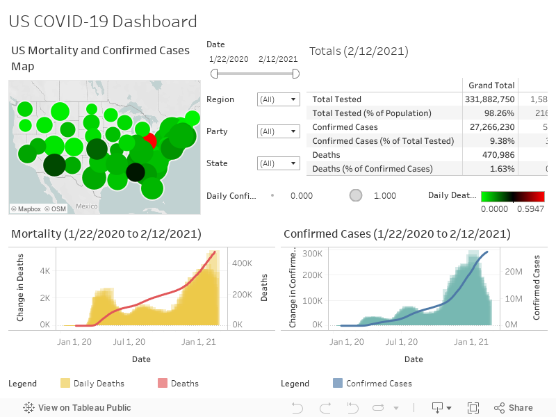
In this article, a United States COVID-19 Dashboard will be provided to help you easily map where your state is with respect to flattening the COVID-19 curve, giving you a better idea of when you can expect state imposed quarantines to be lifted.

State Rankings for Handling of the COVID-19 Pandemic

The interactive chart below ranks each state by the total number tested as a percentage of the overall population. The higher the test ratio against over population, the more accurate the COVID-19 infection rate is and more trust can be placed in a governor's decision to reopen an economy or to keep it shut.

As of today, the most states have yet to test a sufficiently sizable sample of their populations so that governors can make informed decisions whether or when they can reopen their local economies.

Which states are doing the best jobs testing their populations?


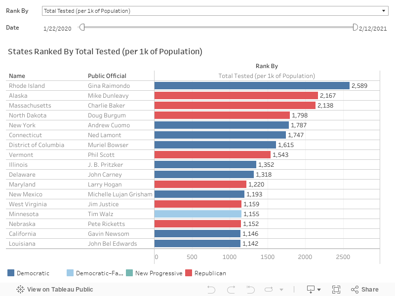
Armed with the information on testing rates above, we can make qualified judgments on the reliability of data provided by each state, allowing us to adjust our informed decisions based on the confidence we place on these results. 

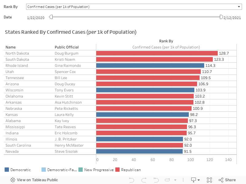
Where are the highest number of confirmed COVID-19 cases?


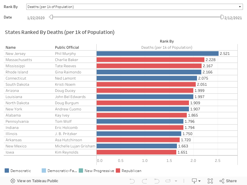
Where is COVID-19 the deadliest?


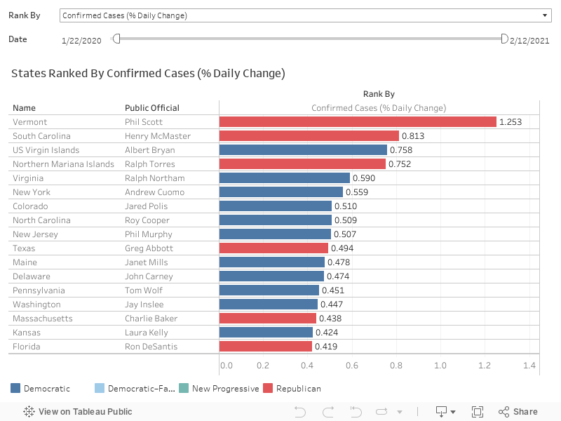
Where are new COVID-19 cases rising most quickly?


The following questions may give you a better idea of not just how prevalent the COVID-19 is, but also how serious the situation is in each state.

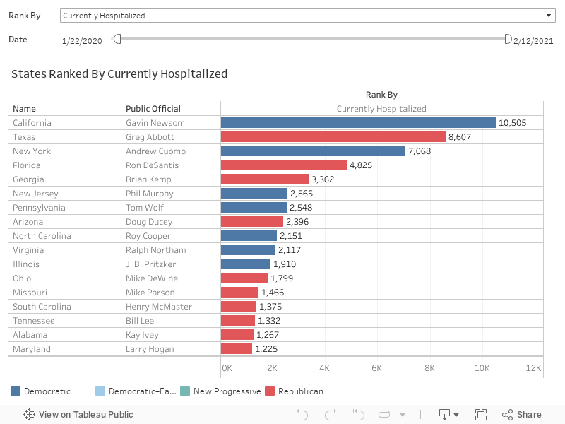
Which states have the most hospitalized cases?


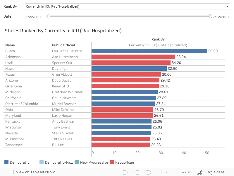
How many among those currently hospitalized are in ICU?


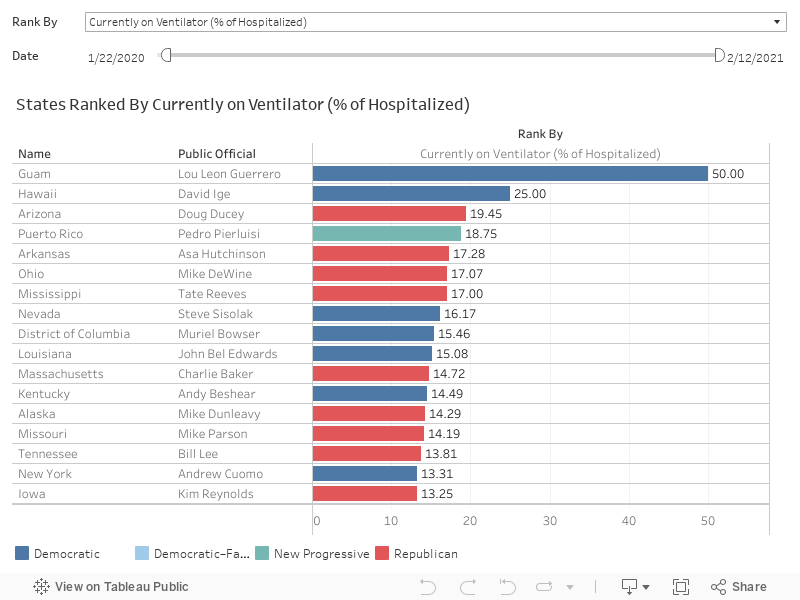
The prognoses for patients on ventilators generally have higher projected mortality rates the longer they remain on it. As tragic as it may seem, knowing how many are currently on ventilators could potentially be viewed as a leading indicator of where death rates are likely to be heading.

What is the ratio of ventilator patients to those currently hospitalized?


Governors face pressure to save their State Economies

Even though we are past the most intense period when medical professionals were heroically engaging in a daily struggle to save the many people at greatest risk of succumbing to this terrible disease, the majority of the United States and a larger part of the world,is still in quarantine to flatten the curve and reduce the likelihood of over burdening hospital infrastructure.

Experts unanimously agree that new daily cases must stabilize and a flattening of the curve in combination with vaccine availability have to happen together before government leaders can safely roll back the most draconian social distancing measures without a resurgence of the virus. Even so, without proper testing, it is very difficult to tell if case counts are a true reflection of what the real infection rate is.

While many realize the importance of social distancing in helping alleviate over burdened local healthcare infrastructure, it is easy to forget that this also results in extending the duration of the virus impact over time.

Flattening the COVID19 curve
Flattening the COVID-19 curve

As millions suffer from the ill effects of a self-induced stalled economy, governors are facing mounting pressure to rescue their battered economies. Some have already reopened their states despite the lack of accurate testing, putting the health of their electorate at risk. So how do you figure out if your state leaders are putting the best interested of their electorate before anything else?

While population testing rates are still grossly inadequate, the amount of data available for analysis is nonetheless overwhelming. To complicate things further, many adjacent states are forming coalitions that will coordinate the easing of social distancing measures to reduce the risk of virus resurgence. As such, it is important to inspect data trends not just your home but in neighboring states to figure out when your own state's restrictions are lifted. Thanks to the collective efforts of the data scientists and engineers at The COVID Tracking Project, (a volunteer effort initiated at The Atlantic), there's a tool for that,

A State based COVID-19 Tracking Tool

The following United States COV-19 Data By State Dashboard can provide you with more detail on how far your state is progressing with respect to flattening the COVID-19 curve relative to the rest of the United States.

United States - Geographical Spread of COVID-19

Click here so that it scales better in a new window.


Hopefully, these tools can help you obtain a clearer picture of where your state stands with respect to its neighbors and the rest of the country. Wishing you all the best as we move forward to the next phase and navigate this difficult time together.

The opinions expressed are solely the views of the author and not necessarily those of his employers, past or present. They should not be construed nor used solely as a basis of any decisions made without forming conclusions from other independently sourced information, related to the handling of the COVID-19 pandemic or otherwise.

Sunday, March 8, 2020

COVID19 - A near real time road map of where we are now

COVID-19 test kit
Lack of testing for high risk individuals is hampering an effective response
A Los Angeles Times article highlighted the shortcomings of the administration's response or lack of it from the perspective of testing for coronavirus or 2019-nCoV (COVID-19).

As anyone with decision making authority would know, the timely remediation of any crisis regardless of scale can only be efficiently carried out following a decision based on facts, and the effectiveness of the accompanying response is in turn dependent on reliable information and sound data. So what tools are currently available to decision makers right now?

Near real time tracking of COVID-19

The Johns Hopkins Center for Systems Science and Engineering (CSSE) recently built an online dashboard based on the following data sources:
According to Dr Lauren Gardner, professor at CSSE, the data visualization was developed as a public service so that everyone can have an updated understanding of the unfolding outbreak situation, Dīng Xiāng Yuán was included as it provides "more timely assessments of the outbreak, compared to the national level reporting organizations, which take longer to filter up".

COVID-19 Dashboards


Interpreting the data

Based on the data collected as of March 8th 2020, it can be observed that reported cases seem to be starting to plateau, at least in China,

Historical chart of COVID-19 cases
COVID-19 cases as of March 8th 2020 since inception
Inspecting the last 2 data points for COVID-19 cases outside of China, one could be led to believe that the same is happening globally; that the situation is stabilizing. However, this is unlikely the case,

Things are probably going to get worse before getting better

To better understand the chart, we should revisit what happened in China and understand what caused the spike in new cases on February 13th 2020.

New daily COVID-19 cases
Chinese COVID-19 cases saw a spike from February 12th to 13th
If you have been keeping up to date wirh COVID-19 news, you will be familiar with the following timeline,

What seems to have happened was that the Chinese government capitulated and added a new category of "cases confirmed by clinical diagnosis" as a result of the ensuing public outcry.

We have yet to see the intense backlash in the United States required to trigger a credible response from the Trump administration comparable to the Chinese government. Without transparency around test kit shortages or resolving laboratory test pipeline blockages followed by test results transparency, it is likely any semblance of stability might sadly just end up being a false positive without more extensive testing and the potential spike of new cases that are expected to follow.

The opinions expressed are solely the views of the author and not necessarily those of his employers, past or present. They should not be construed nor used solely as a basis of any decisions made without forming conclusions from other independently sourced information, related to the handling of the COVID-19 pandemic or otherwise.

Monday, January 28, 2019

The Compelling Case for Rare Cancer Research

Hope and light at the end of the tunnel
Leading edge research offers much needed hope to rare cancer patients
Ever since its discovery in the late 18th century by the English surgeon, Sir Percivall Pott, "cancer" has always been the word that nobody wants to hear in their conversations with their physicians. While cancer treatment regimes have progressed rapidly, particularly in the development of radiation and chemotherapy addressing the more common cancers, the efficacy of treatment in rare cancers has not been accorded the same level of success.
 

Odds are stacked against a positive outcome for Rare Cancers

Cancer research like any other subjects based on scientific inquiry are highly dependent on data. Gaining insightful conclusions from data with a reasonably high confidence level requires a decent population sample size. Ceteris paribus, the larger the population, the higher the confidence level.


When inspecting data collected by the National Cancer Institute under their Surveillance, Epidemiology, and End Results (SEER) program, one can observe that incidence and mortality rates in the most commonly diagnosed cancers have trended lower or remained stable over the years. In fact, anyone diagnosed with a common cancer other than Lung and Bronchus today, has a more than 50% survival probability on average.


Unfortunately the prognosis is a lot worse for rare cancer diagnoses, people fighting 3 of the 10 rarest cancers (Chronic Myelomonocytic Leukemia, Kaposi Sarcoma and Mesothelioma) almost certainly face death in the event of a diagnosis as historical mortality rates have stubbornly remained close to or at 100% for the past 10 years. That said, every person is different. Encouraging words that most cancer survivors would have heard from their oncologists.

The diverse and complex nature of the human body is also the reason why more resources must be allocated to rare cancer research, especially so given the relatively fewer data points from rare cancers.

The Positive Effect of early detection on Mortality Rates

Staging data is sparse for rare cancer diagnoses. It is also likely that data availability is further exacerbated by the difficulties encountered by doctors and medical professionals being able to clinically stage rare cancers successfully. However, based on data collected for more common cancers, a recurring theme is echoed by the data: early detection leads to better mortality outcomes.


In the chart above, the cancers with high mortality rates bear the common characteristic of late stage detection after the disease has already metastasized or was unstaged (indicated by taller dark orange and red bars). It will not be unreasonable to draw the conclusion that the same effect of early detection would apply to rare cancers as well.

A Call to Action

In 2007, Jennifer Goodman Linn (1971 - 2011) founded Cycle For Survival after battling Malignant Fibrous Histiocytoma (MPH) Sarcoma for 4 years. This is her fearless story.


Rare cancer research is underfunded, leaving people fighting these cancers with few options — sometimes none. Because of the generosity of people like you, Cycle for Survival is changing that.
  • 100% of your gift will fund research led by Memorial Sloan Kettering Cancer Center to advance new and better treatments. All funds will be allocated within 6 months of the events. Cycle for Survival will share what was funded and continue to keep us updated on progress.
  • Discoveries will benefit cancer patients everywhere. Memorial Sloan Kettering treats over 400 subtypes of cancer each year and collaborates with institutions around the world.
  • Many cancers are considered rare — lymphoma, thyroid, ovarian, brain, pancreatic, all pediatric cancers, and others — and together we can give doctors the resources they need to beat them.
If you are able to make a financial contribution, you can choose any of the options below or make a donation at the main page and give rare cancer patients a fighting chance!
  • Follow the link sent by your contact to take you to their personal fundraising page. It should begin with http://mskcc.convio.net/goto/<followed by their name or team> and click the donate button.
  • Search by your contact's name to get to their personal fundraising page.
  • If you know the name of the team that your contact is riding with, you may make a donation from their team page.

Thank you in advance for your contribution and do help spread the word to truly make a difference by using the share button below!

Sunday, January 6, 2019

Who owns the Government Shutdown? The potential Crimson Fallout after the Blue Wave

Republican elephant and Democrat donkey over a cracked wall
Cracks are developing in President Trump's border wall strategy

As the United States limps through the longest government shutdown in the nation's history and reels from the increasingly grave, lasting negative impact on its many innocent citizens and federal employees, President Donald Trump has thus far stubbornly insisted that his demands for more than $5.7 billion of American tax payer money to fund the border wall be met, despite his grandiose campaign promise of being able to stick the bill on Mexico instead. The Democrats have no less been steadfastly holding their ground under the leadership of Speaker Nancy Pelosi and Senator Chuck Schumer.

Yet when the dust settles down, one lingering question that is bound to remain in everybody's mind is: Who will pay the political price of such willful negligence?

Do Americans believe that the damage to the country is all due to the Republicans and President Trump's self-inflicted wounds or are the Democrats equally culpable?

The Psychology of Word Associations

Word associations have long been thought to reveal a subject's subconscious state of mind. Following this trend of thought, it is possible to guess what Americans are thinking based on how they are doing their web searches related to this topic.

In 2006, Google launched a service that analyzes the popularity of search terms over a period of time: Google Trends.

Although the actual counts of searches are not revealed, a derived index (pegged at 100) based off the maximum number of search requests during a user defined period can be displayed. Every other point within the time series is calculated as a percentage relative to the period's maximum value,

Upon running a comparative search of the terms "Trump Shutdown" or "Republican Shutdown" versus "Democrat Shutdown" starting on December 15th 2018, one week before the government shutdown began on December 22nd 2018 to today, searches for the words "Trump Shutdown" vastly overwhelm searches for the words "Democrat Shutdown" by a ratio of more than 90 to 1 in all 50 states. This could mean that one can garner with reasonable accuracy, insight on public perception of the the government shutdown; indicating that every time someone initiates a keyword search and begins typing, their fingers are physically expressing that President Trump owns and/or is the root cause of the shutdown.

Google trends chart of interest over time
Google Trends (December 22nd 2018 to January 25th 2019) - Interest Over Time

Even in the traditionally red states as shown in the graphic below, Trump has consistently been associated with the shutdown more than 90% of the time as opposed to the Democrats throughout the sample period.

Google trends map comparing breakdown by region
Google Trends (December 22nd 2018 to January 25th 2019) - Compared Breakdown By Region

A Crimson Fallout in the making?

While the writing on the wall (in a not so subtle reference to border security) may not be set in stone at this point, Trump seems to have inextricably tied his name to the government shutdown and this more likely than not, raises dark clouds for him and the future of the Republicans who blindly stand by him. It is highly doubtful that even the master of alternative facts can manipulate the narrative to avoid the ensuing crimson political fallout this time.

Update: The cost of the border wall has been edited to reflect its increase in costs. The shutdown eclipsed the previous record of 21 days as of January 12th 2019. Data visualizations have been updated to include the phrase "Republican Shutdown", and reflect the end of the shutdown on January 25th 2019.

Sunday, September 9, 2018

The Gini behind those Crazy Rich Asians

Genie and Crazy Rich Asians
Nice smile... I wonder what the Gini coefficient of Singapore is?
This isn't a "get rich quick" playbook based on an elusive genie in a bottle, instead it is a rather brief introduction to the Gini coefficient; an index which measures wealth distribution across a given sample population (usually applied to measure income equality at a national level).

It was a slow weekend and what better way is there to waste the hours away than at a movie theater, vicariously living the lives of the top one-percenters? Crazy Rich Asians was an awesome movie and it was easy for the audience to feel connected as some of those characters even seemed mildly down to earth, maybe sometimes even remotely admirable.

Upon leaving the dark comfort of the cinema being rudely greeted by the harsh glare of the afternoon sun, I faced the stark reality of resuming my rightful place with the 99 percent as was expected of my birthright. My mind idly wondered what the Gini index of Singapore (the movie location) was, relative to the rest of the world. A quick web search led to a publication by the Central Intelligence Agency.

From The World Factbook, Country Comparison: Distribution of Family Income - Gini Index:
"Distribution of family income - Gini index measures the degree of inequality in the distribution of family income in a country. The more nearly equal a country's income distribution, the lower its Gini index, e.g., a Scandinavian country with an index of 25. The more unequal a country's income distribution, the higher its Gini index, e.g., a Sub-Saharan country with an index of 50. If income were distributed with perfect equality the index would be zero; if income were distributed with perfect inequality, the index would be 100."
Although the data set is tiny, it's always easier to interpret it visually and a simple data visualization is attached below. One modification I applied to the data was ranking each country's Gini index in ascending order as opposed to descending order on the original data set. My subjective opinion even if unorthodox, being that the most equitable economies should be associated with a better ranking. Incidentally, Singapore was mediocre at best, ranking 122nd out of 156 with an index of 45.9 (based on 2017 data). However, do bear in mind that the data is extremely patchy and calculation of the Gini coefficient was based on income from different years for different countries.

The Scandinavians and European Union were unsurprisingly ranked the most favorably as equitable economies, while the most inequality was unfortunately skewed heavily towards banana republics and Southern African nations. The United States did not fare very well too, at 118th place (index of 45.0 based on 2007 data).

Have fun exploring the data and do share your thoughts below!

Thursday, May 3, 2018

Get SMART with best practices for building highly scalable Excel spreadsheet solutions

Get Smart
Get Smart - Issue #3, The Nuclear Gumball Caper (November 1, 1966)
Spreadsheets have long prevailed in the world of trading strategies, valuation, risk and operations. The primary reason being that they are the easiest and quickest way to transform ideas from abstract concepts to concrete solutions. Still, uncontrolled spreadsheets resulting in disastrous consequences have dominated news headlines in various high profile cases within the past few years.

While a prohibition of spreadsheets would be an extreme application of blunt force trauma at the expense of product delivery times to market, unfettered spreadsheet development swings the pendulum too far to the other end of the scale. As such it is very important to practice intelligent design principles and implement reasonable audit controls.

Described below are the fundamentals of good design that should be central to all spreadsheet development strategies:

Standardization

Inconsistency is the mother of mistakes. The introduction of errors in the design and development process can be reduced by establishing standards and standardizing design patterns. Listed below are a few spreadsheet development best practices which should ideally be followed whenever it is reasonable to do so:
  • Follow the universal formatting guidelines for user interfaces within the context of each business application.
  • Object names (such as worksheets, named ranges and tables) should apply relevant standard naming conventions as far as possible.
  • Use Hungarian prefixes if applicable depending on invidual use cases.
  • Apply good coding practices such as meaningful variable declarations and format VBA code in macro enabled spreadsheets with proper indentation.
  • Err on the side of verbosity when commenting on code.
Many spreadsheet solutions co-mingle business logic and data. This can introduce major operational risks as a design change request which takes a few days to implement needs to be reconciled with the production version if new data is created and saved on a daily basis. Facilitate the use of standard design patterns by separating business logic and data through user defined configurations, this will greatly reduce the opportunities to commit transposition errors.

Minimalism

The concept of minimalism in design involves stripping everything to its most essential simplistic form while still retaining completeness and elegance in function without compromise.

Keep it simple! Financial computations are complex and can require bespoke solutions even when dealing with the simplest of exchange traded financial products and markets. This is unavoidable, yet it is still usually possible to decompose each problem into simpler digestible pieces, incorporating standard practices and design concepts.

In other words, break a complicated business or financial model into simple isolated modules which handle the minimal functional requirements of each individual component. This not only reduces operational risk but also allows the spreadsheet developer to quickly react to changing environments, which brings us to the next point - agility.

Agility

Agile methodologies use incremental, iterative work sequences that are known as sprints. Clearly delineate business logic and data through the use of read-only spreadsheets, so that spreadsheet design is kept highly adaptable in response to business requests. Spreadsheet developers are thus able to focus on design and development without having to constantly merge new business logic updates with current data from active production versions. This fosters an Agile “iterative change” mindset by reducing deployment times and facilitating communication with the business as everyone can be inspecting and testing with the same data set.

Robustness

Robustness and reliability should always be front and center of any production environment. Ensure that users launch the official “golden copy” of a spreadsheet (even when copied to local drives offline) every time the file is opened. Spreadsheets should be configured to automatically closed at midnight at the end of the day. This not only ensures that the latest updates are applied but also handles situations where unforeseen rollbacks to previous versions are necessary.

Log all end user actions autonomously with VBA code in an easily track-able centralized repository, helping production support teams anticipate problems and keeping them operationally ready to handle potential system breaks on a timely basis.

Teamwork

Encourage collaboration and teamwork, by granting end users the freedom to make copies of the spreadsheet workbooks or templates to experiment on new ideas, without compromising on the integrity of the production environment. These can later be shared and discussed with developers who can then incorporate the changes into the official versions after they have been rigorously tested.

Do share anecdotes on how these best practices have helped you or if you have any personal insights to improve the spreadsheet development processes below!

Monday, March 6, 2017

Applying data science for effective strategic planning: Designing and building a data warehouse


Cloud network
Does your data warehouse belong in the cloud?

Are you interested in leveraging proprietary data that is already being collected by your organization or doing the same with readily available public data? Data science and business analytics should not merely be viewed as the latest buzzwords. But rather as a combination of formal disciplines in the arts and sciences, some possibly even traditional.

This article describes my thought process behind the choice of storage platform focusing on the Google Cloud Platform from a high level with respect to the volunteer work I performed for the JerseySTEM (a non-profit organization), where data from the State of New Jersey Board of Education had to be analyzed; primarily to meet the objectives of identifying under-served communities and efficiently allocating resources for Science Technology Engineering and Mathematics (STEM) educational initiatives.

This is not a technical "how to" document. There are already many other well written tutorials available on the internet so there is no real need to reinvent the wheel. However, documentation links have been included whenever they were referenced as part of my decision making process.

The Big picture


Although this article focuses on the planning and design of the data repository within a data analysis project, it is worthwhile noting where this fits with respect to the SAS Analytical Life Cycle (taken from the white paper on Data Mining From A to Z).

SAS Analytical Life Cycle

As shown above, we are merely concerned with data preparation at this point. But there will be considerable impact on downstream processes or significant productivity loss from rework if this early stage phase is not well planned or executed.

Considering cloud hosted services


Unless you were pulled into a project at the ground level, there would usually be a data repository already available in most situations. However specific to the JerseySTEM use case, although the external source data was previously established, there was no existing functional and working data repository already in place that was usable for performing the research and analysis that was required. As such, there was a need to build the database from scratch.

Being a non-profit organization project, it was extremely important to be sensitive to the requirement of being cost conscious. Even so, I did not want to compromise on the pre-requisites of having a robust, easily supportable and scalable model that outsourced cloud platforms provided - via Software as a Service (SaaS), Platform as a Service (PaaS) or Infrastructure as a Service (IaaS).

Hence, my first order of business was to consult with industry subject matter experts who had experimented with cloud technologies before as end users. I found that there existed a general consensus among them that cloud storage pricing was cheap to start with. But could potentially escalate if there was a future need for high bandwidth extraction of data due to egress charges; akin to the cost structures of back-end loaded mutual funds as an analogy.

That said, the biggest attraction to a cloud based data storage solution to me personally, was that it was lightweight in terms of support from the organizational angle, something extremely valuable to a non-profit organization since volunteers come and go.

Bearing in mind that every use case is different, we could control operating costs by:
  • Limiting egress activity, in our case, to our internal team of data analysts and scientists. Public data could be published to other more cost efficient platforms for general consumption without turning on public access to the database.
  • If need be, we could turn the database on/off (like the light switch in a room) whenever our data analysts needed to access the data, conditional upon an additional separate layer for public access as described in the previous point and given that the external sourced data is only updated annually.

Exploring different cloud storage types


Given our very specific requirements, I decided on a cloud based solution with Google since it was less cumbersome administratively as we were already using their email services. Furthermore, there was a requirement to convert a significant number of address locations from the school directory to GPS coordinates in an initial upload of school reference data into the database. Google was offering $300 in credits over a limited trial period, and the ability to reduce the amount of manual labor associated with free GPS look ups using the Google Maps Geocoding API albeit for a limited time sealed the deal.

At the end of the day, given that the data in question was highly structured and also not within the realm of big data (size wise), I chose a traditional MySQL Relational Database Management System (RDBMS) hosted on Google Cloud SQL. It didn't make sense purely from a data storage perspective to attempt to fit a square peg in a round hole by forcing the data into a NoSQL solution such as Google Cloud BigTable or Google Cloud Datastore. Despite spending some time considering and experimenting with NoSQL options simply due to their more affordable storage pricing model, it was still time well spent as they could be more efficiently and cost effectively deployed when the need arose for more complex data analyses in the future.

Data repository design


I spent years working as a front office desk developer in financial services. Those familiar with the industry would know that it basically entails direct interactions with traders and salespeople, involving high impact deliverables with time critical turnarounds. Having come from this background, I realized early on in my career, the importance of designing and building easily supportable and highly configurable applications. By applying similar design principles within the world of database schema design, this meant keeping the schema as flexible as possible with the ability to scale not just in terms of size but also functionality.

Extract, Transform and Load

Before we could proceed with any form of analysis, the data had to be extracted, transformed and loaded into a database, as is commonly known as the Extract, Transform and Load (ETL) process within the data industry.


ETL process

With the education data, the majority of it sat in Excel spreadsheets and Comma Separated Value (CSV) files, mostly as some form of pivot table segregated by worksheets or files per academic year. All this had to be transformed into a format that would fit data uploads into a normalized RDBMS table, where data quality would then have to be validated and finally retrieved as Structured Query Language (SQL) queries formulated for analysis in the decision making process.

Data quality is paramount

Data Management Association (DAMA) Data Management Body of Knowledge (DMBOK)

As most data professionals are probably familiar with, the ETL process is only a subset of the 11 data management knowledge areas (see the Guide Knowledge Area Wheel) as stipulated in the The Data Management Association (DAMA) Data Management Body of Knowledge (DMBOK). But this topic is beyond the scope of this article. Interested readers can refer to the DMBOK for a deeper understanding of data management best practices. For now, it would suffice to say that data quality is paramount and reasonable efforts should be dedicated to any data science and analytics project to avoid the dreadful situation of "Garbage In Garbage Out"!

Conclusion


In summary, anybody planning on building a data warehouse from scratch should consider all options, from building and supporting it in house to vendor outsourcing with a cloud service provider. Be familiar with and aware of the different pricing packages available and the costs (both in terms of time and monetary investments) associated with each option, always factoring that in your final decision.

This post was first published on LinkedIn.


Search This Blog